Challenge
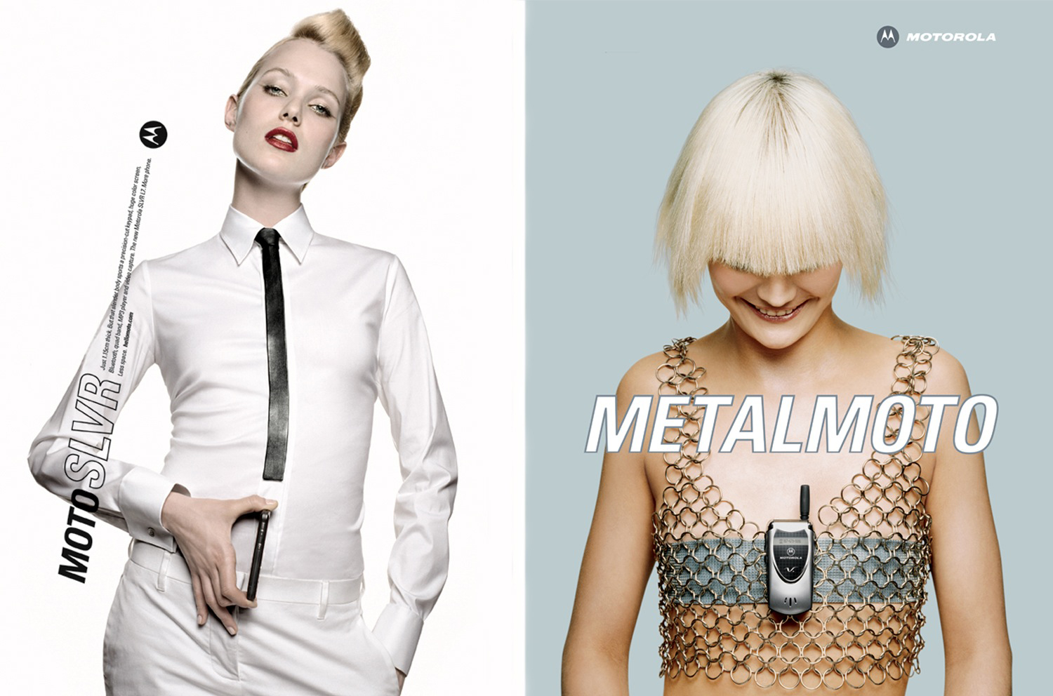
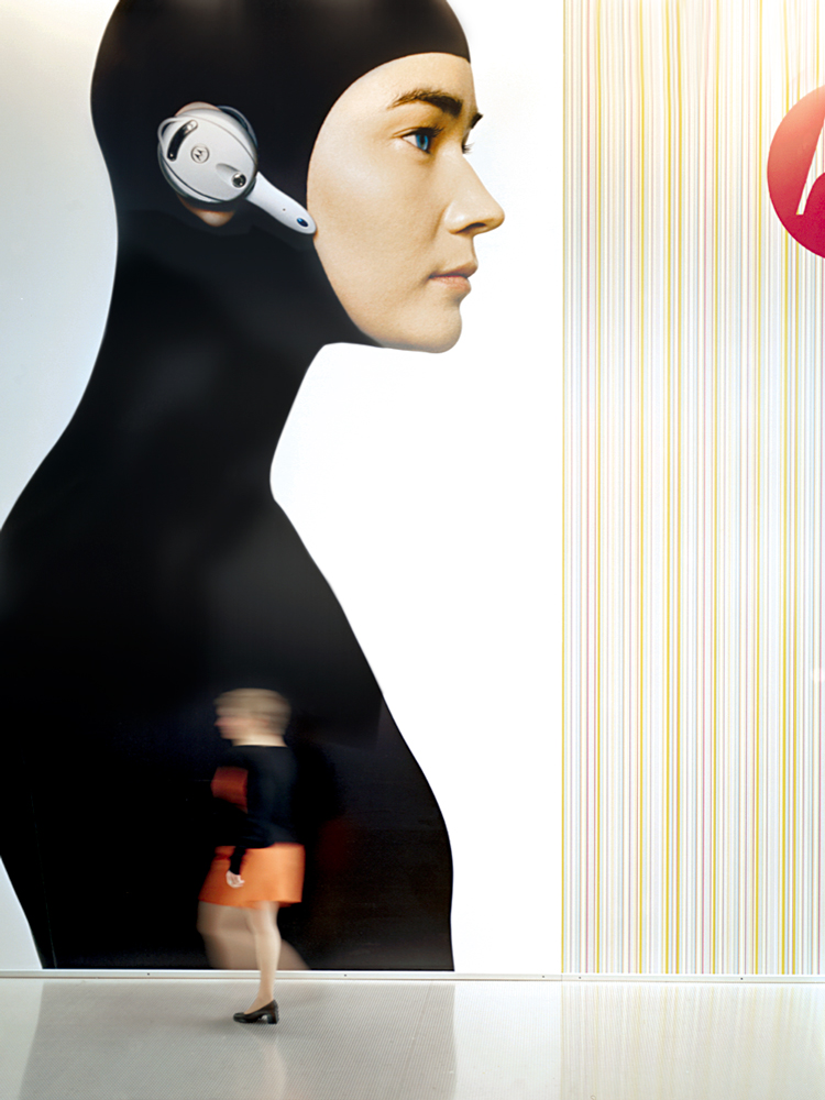
An engineering-driven culture, Motorola excelled at making mobile phones as tools for function and productivity. But consumers valued product design over engineering. Phones were not tools. Phones were fashion. Motorola knew it needed to respond by repositioning and re-launching their brand to appeal to a younger, style conscious consumer.
Strategy
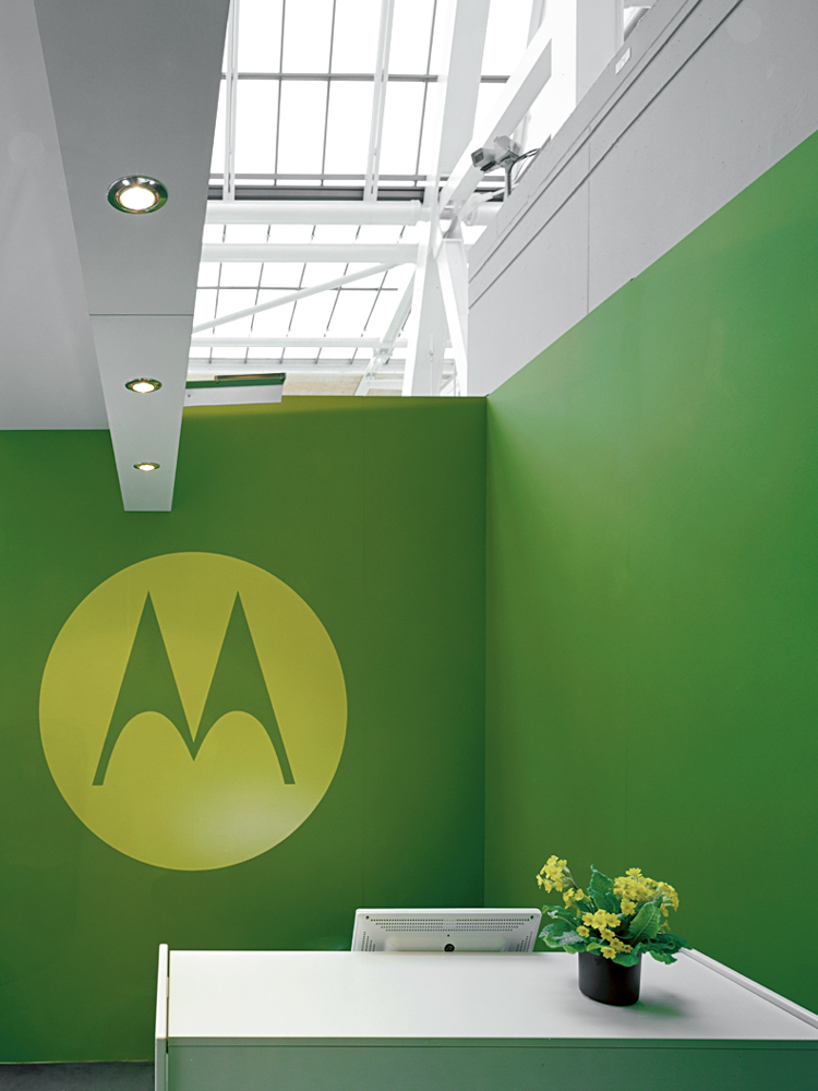
The company wanted to dump its iconic, 75-year-old “em-signia” mark. But we argued you shouldn’t dump a quarter century of equity. You should just reanimate it.
Solution
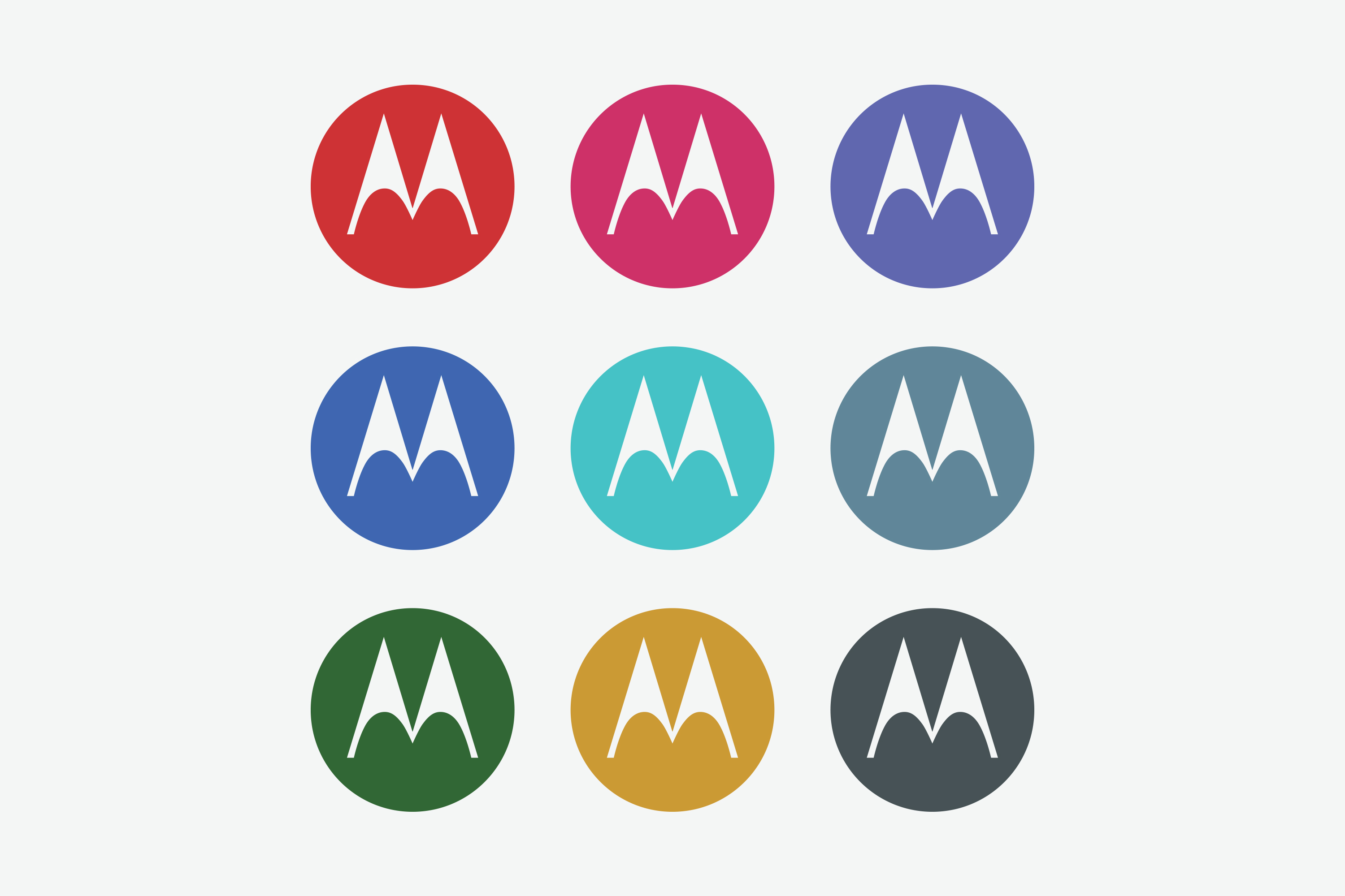
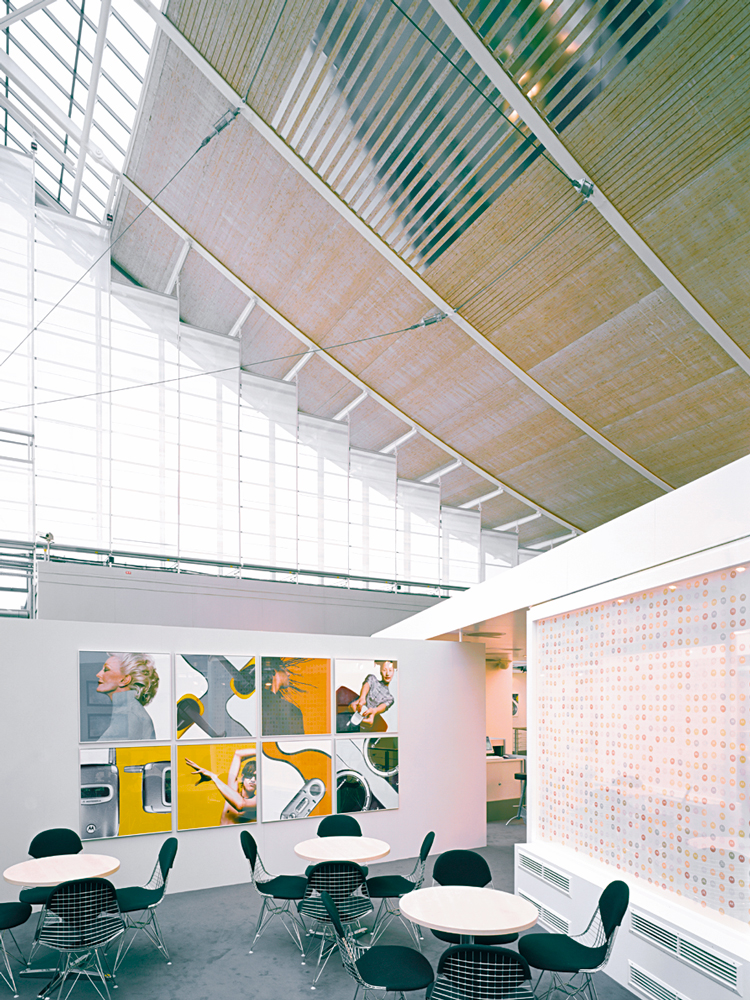
Other technology companies opted for a white, chilly minimalism. But to distinguish Motorola from its rivals and from the busy retail outlets in which its products would be sold, we injected the company’s identity with a shot of color – 18 different hues, ranging from fuchsia and burnt orange to deep blue. We also learned that Japanese youth culture called their phones “Motos.” Recognizing the immediate connection to the brand’s name, we exported the Japanese calling card around the world. This design-forward posture debuted at CeBIT (the largest digital communications and telecom industry show) in Germany and won “Design of the Year.”