With the endless number of playlists, podcasts and live streams we carry around in our pockets, the idea of listening to a “radio station” feels antiquated. But many of us make an exception for our local public radio station, because they capture what can’t be recreated by a line of code—the pulse of the community we live in. Instead of artifacts of the past, our public radio stations are usually the first to understand—and express—what it means to live in our city at any moment.
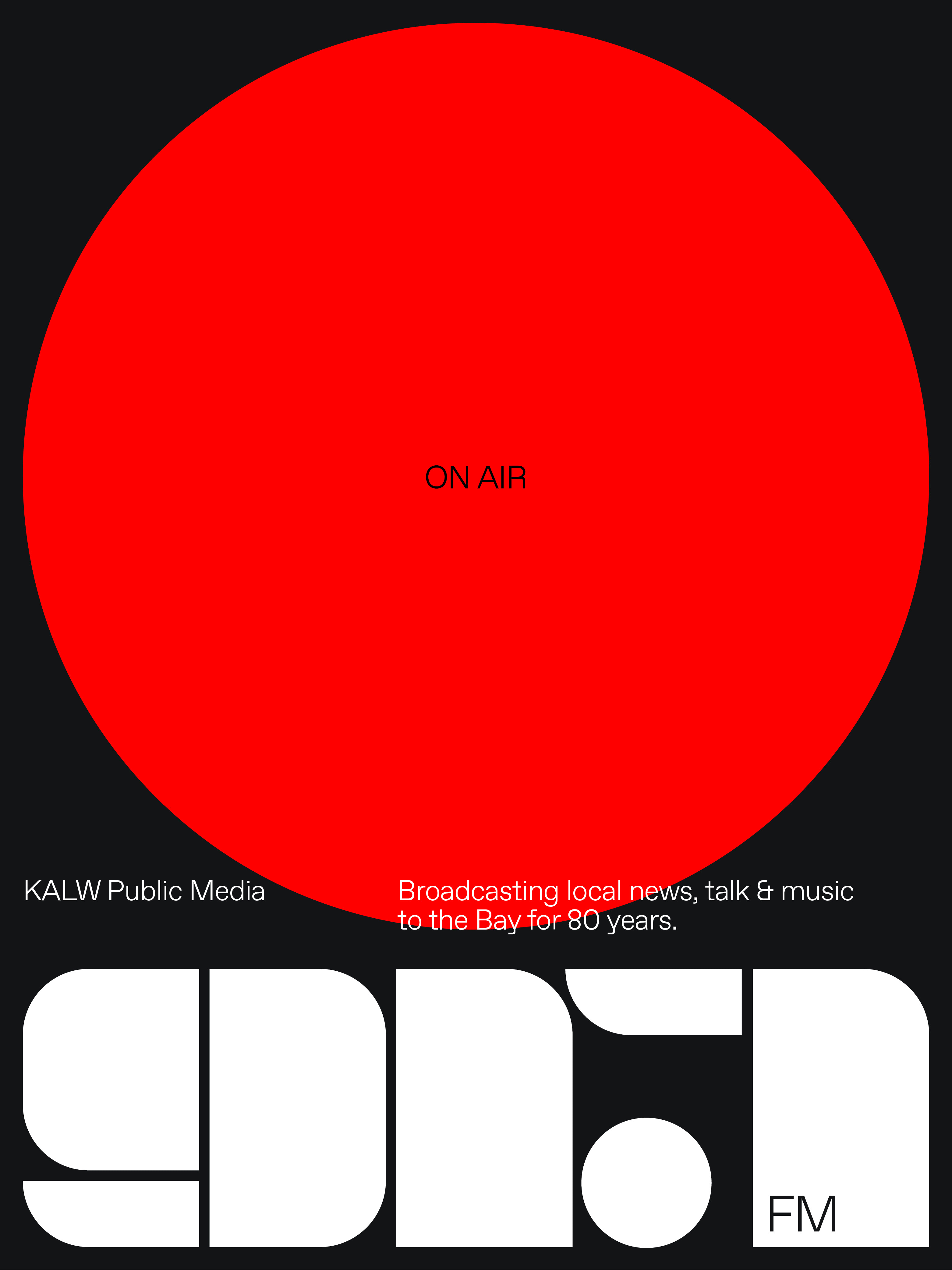
For the past 80 years, KALW has been that radio station for the Bay Area—as well as a pioneer for many public radio stations around the country. They were the first FM station west of the Mississippi; the first FM broadcast training program in the country; one of the first to train women in radio broadcasting during World War II; and one of the first to bring NPR and BBC World News to the west coast. Fiercely dedicated to all nine Bay Area counties it serves, KALW is still at the forefront of what a public radio station can be—producing local talk, news and music shows that are socially-minded, solutions-oriented and community-focused.
THE CHALLENGE
KALW came to us for a new identity to celebrate their 80th anniversary and propel them into their next 80 years. However, their audience’s listening habits had changed 180º since they went on the air in 1941. Now, everyone—especially people as tech savvy as those in the Bay Area—can listen to anyone and anything from anywhere in the world.
It became clear that we needed to create more than just a new logo for the station—we had to find a visual language and voice that gave a local, terrestrial, public radio station with a small budget a way to stand out and remind their community why they matter.
THE SOLUTION
We’re no strangers to KALW—we’ve had a studio in San Francisco for a number of years. We know first-hand the one thing they have that AI-driven algorithms and global podcast celebrities don’t is a history, knowledge, and personality that distinctly reflects the Bay Area. They’ve always captured the diversity and forward-looking ethos of the region by keeping their ears to the streets they serve.
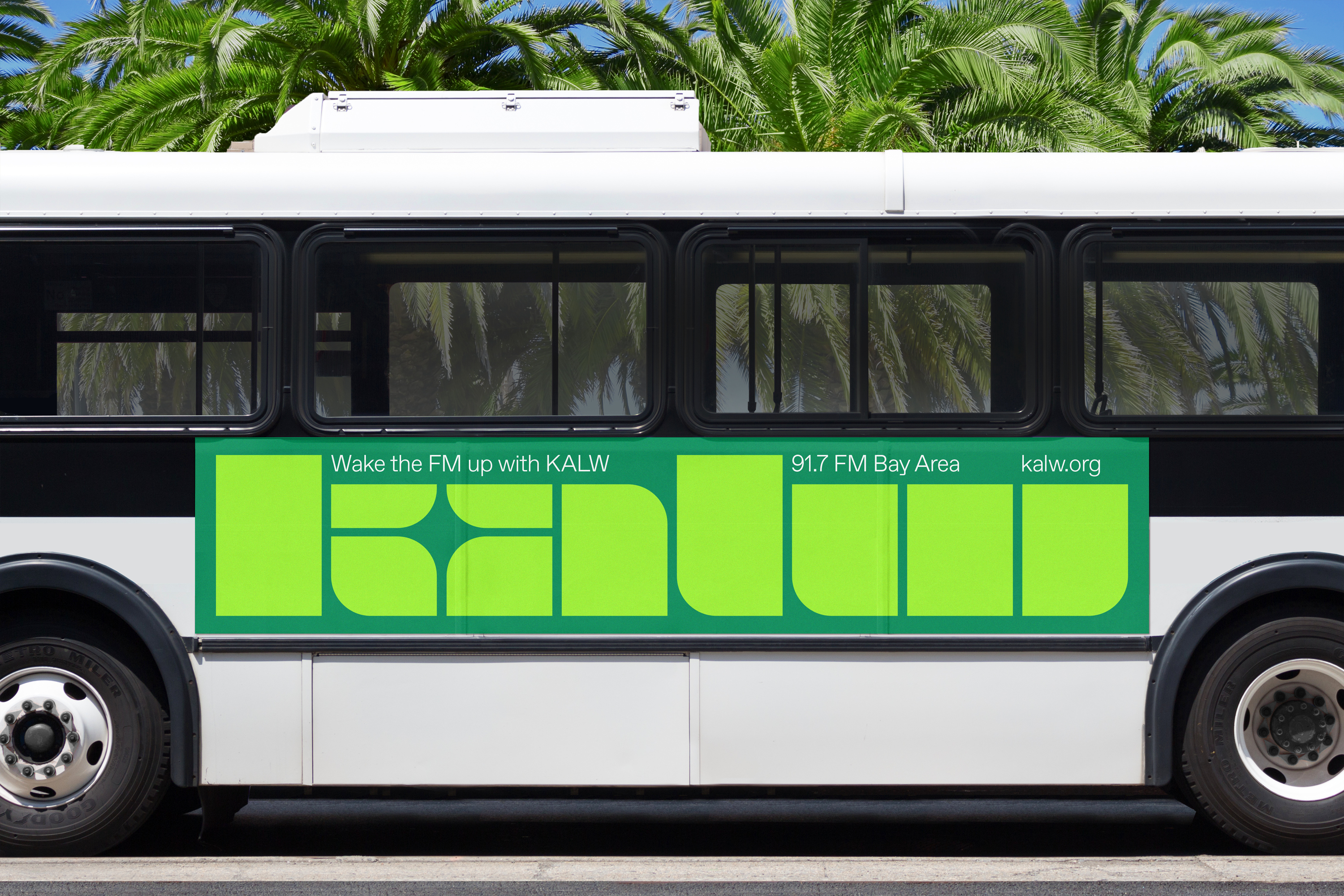
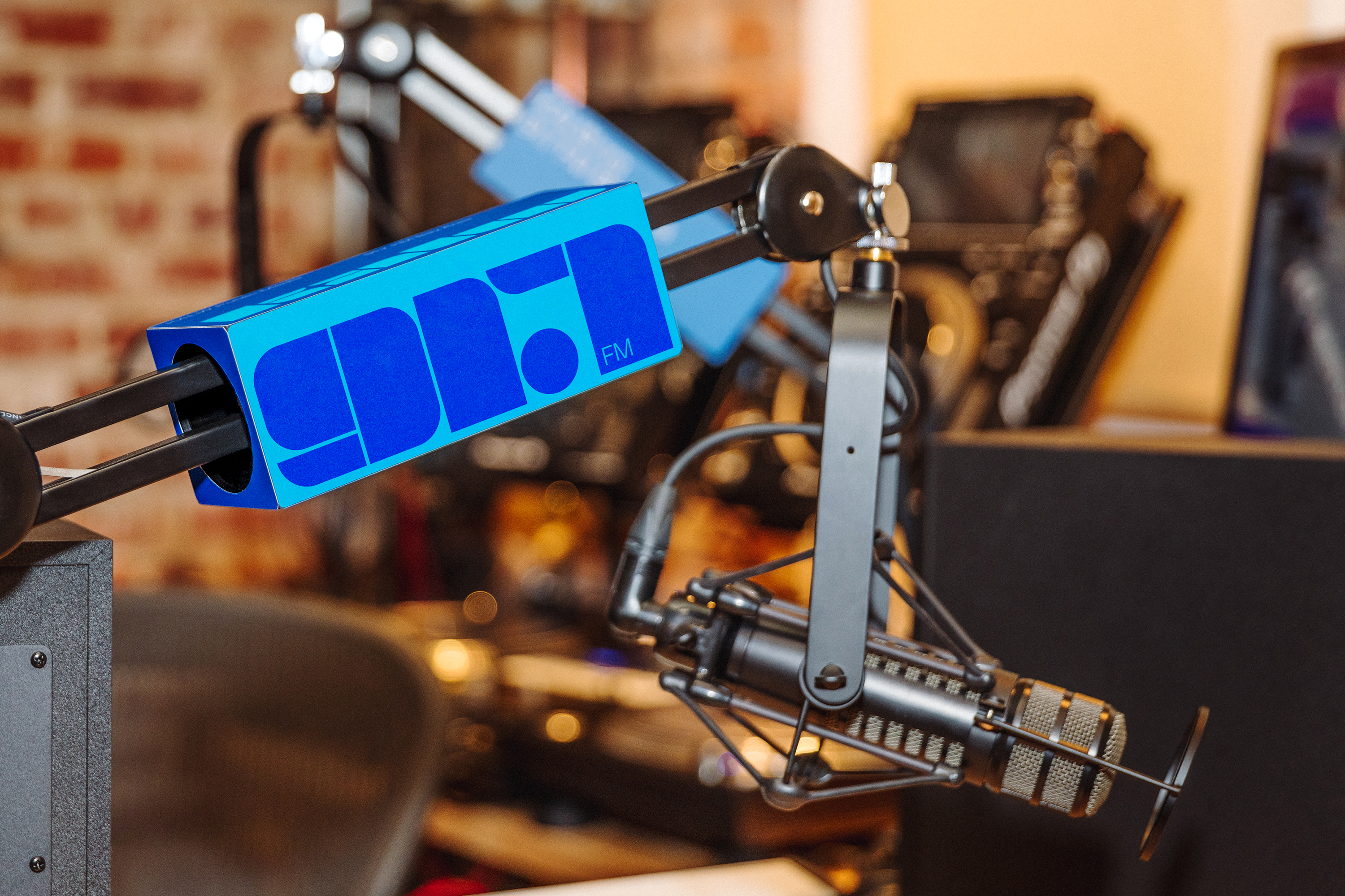
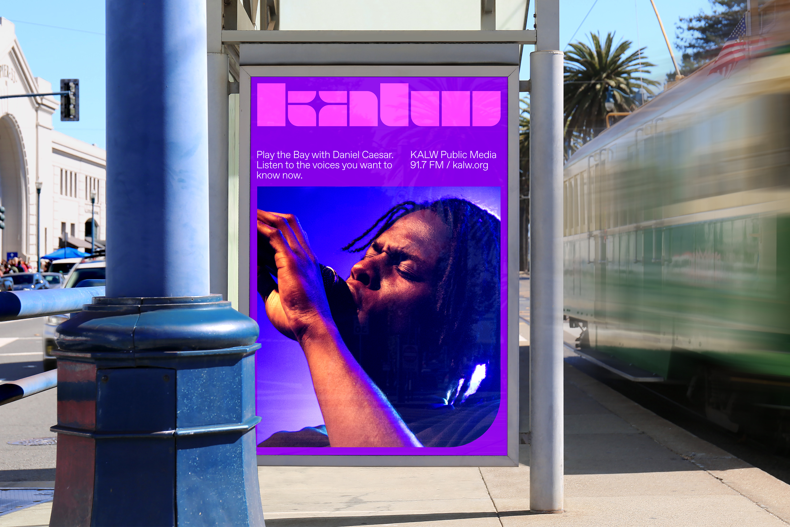
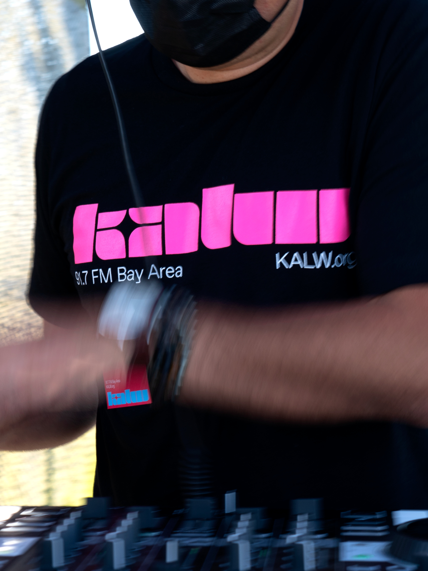
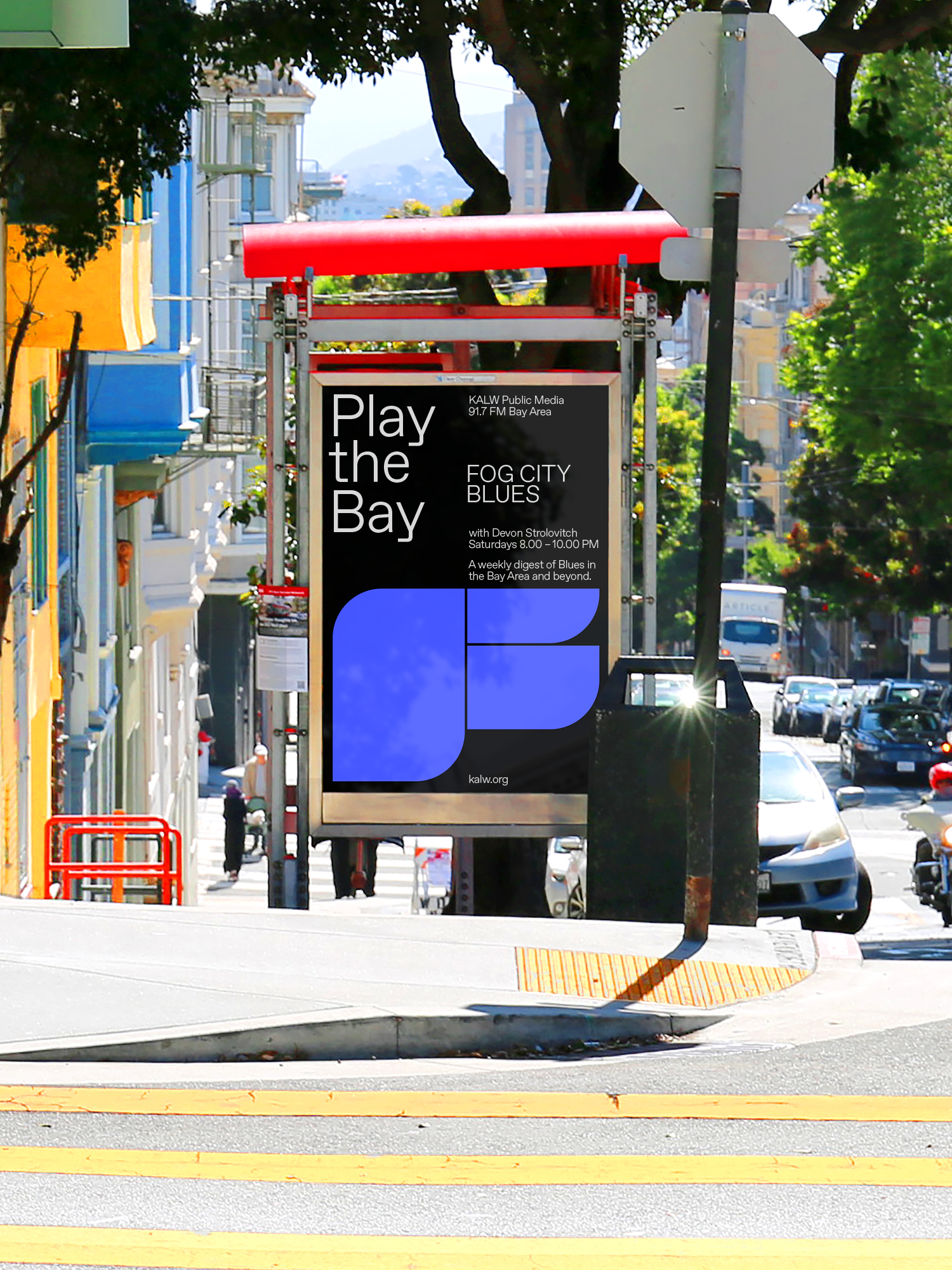
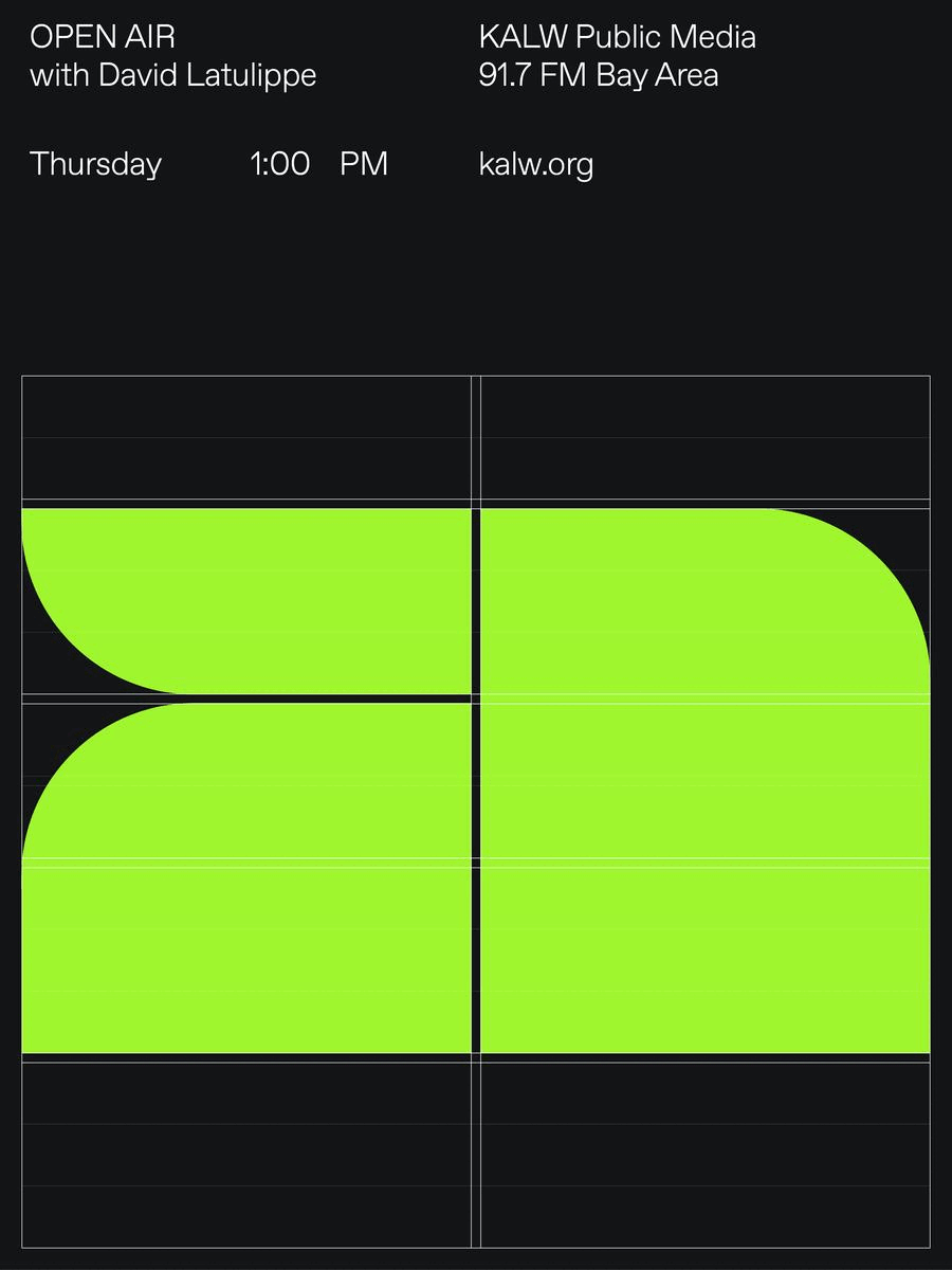
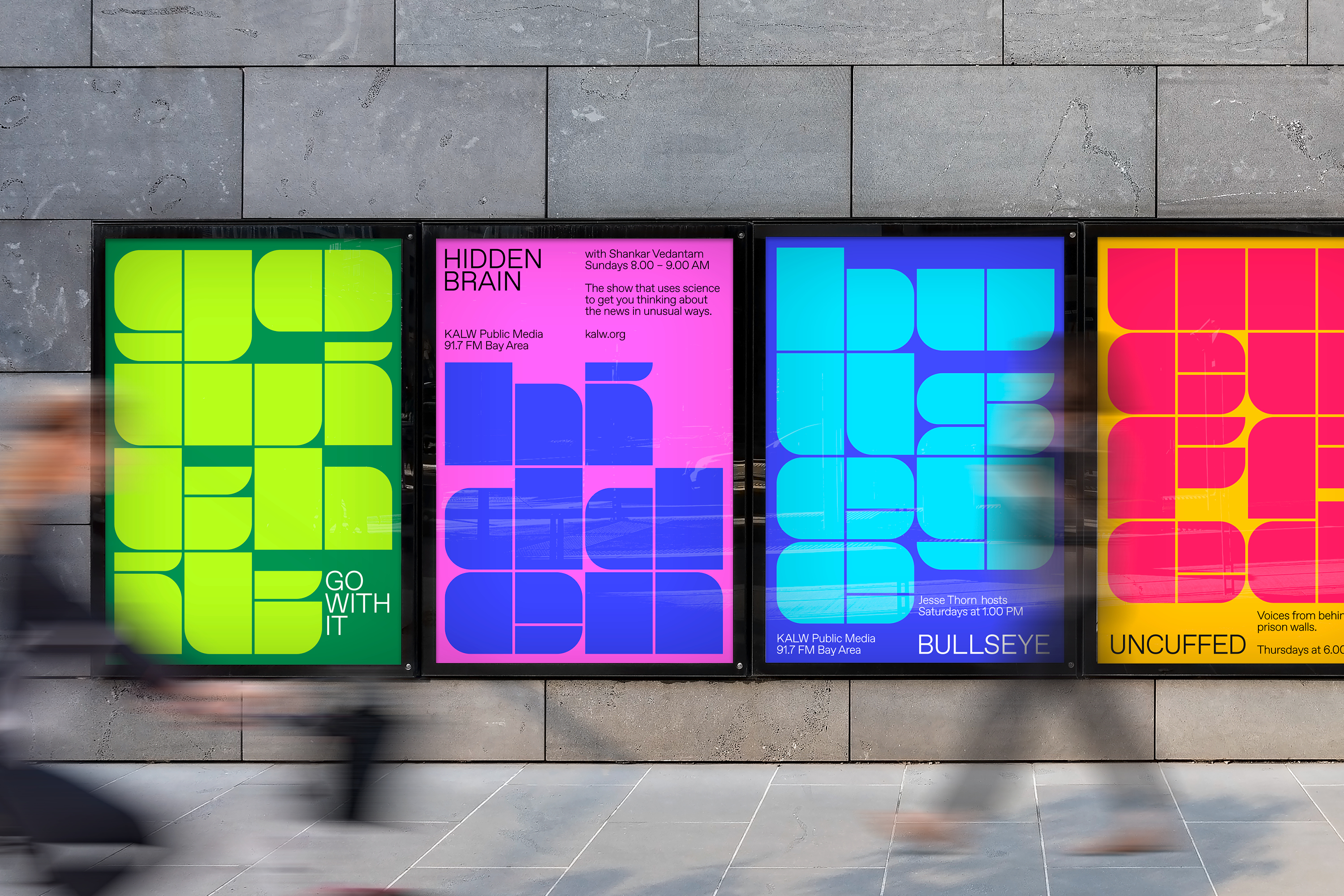
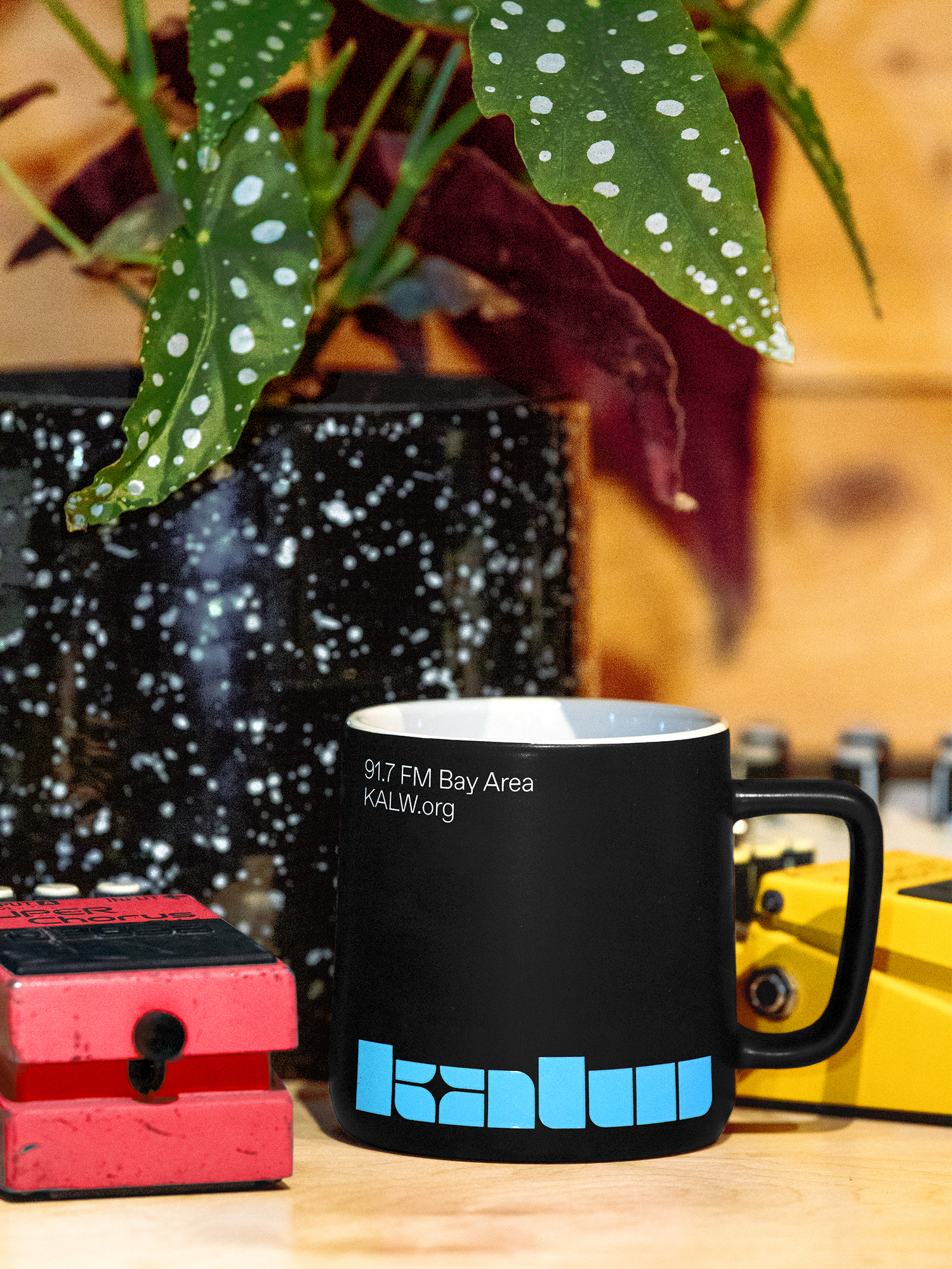
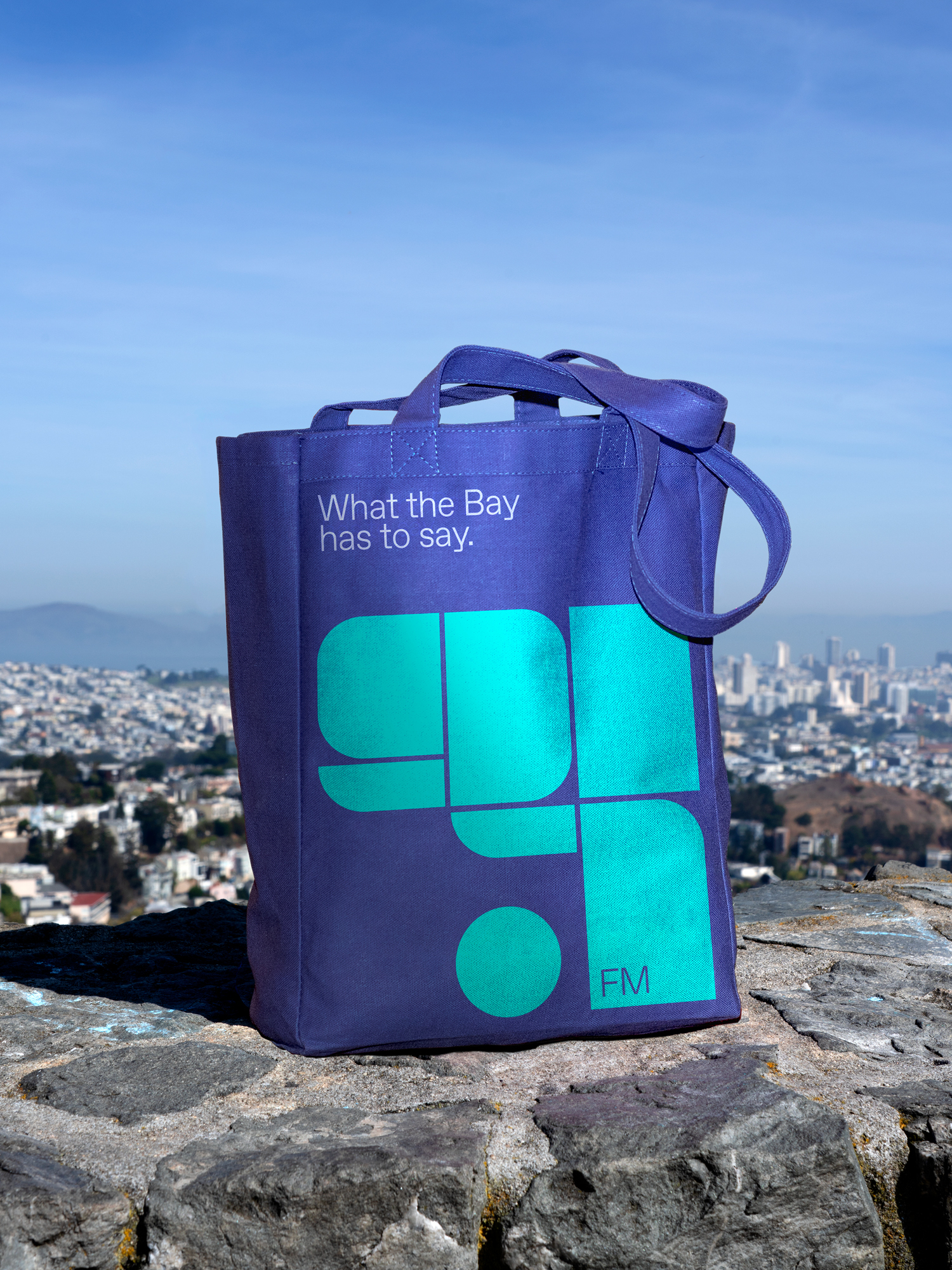
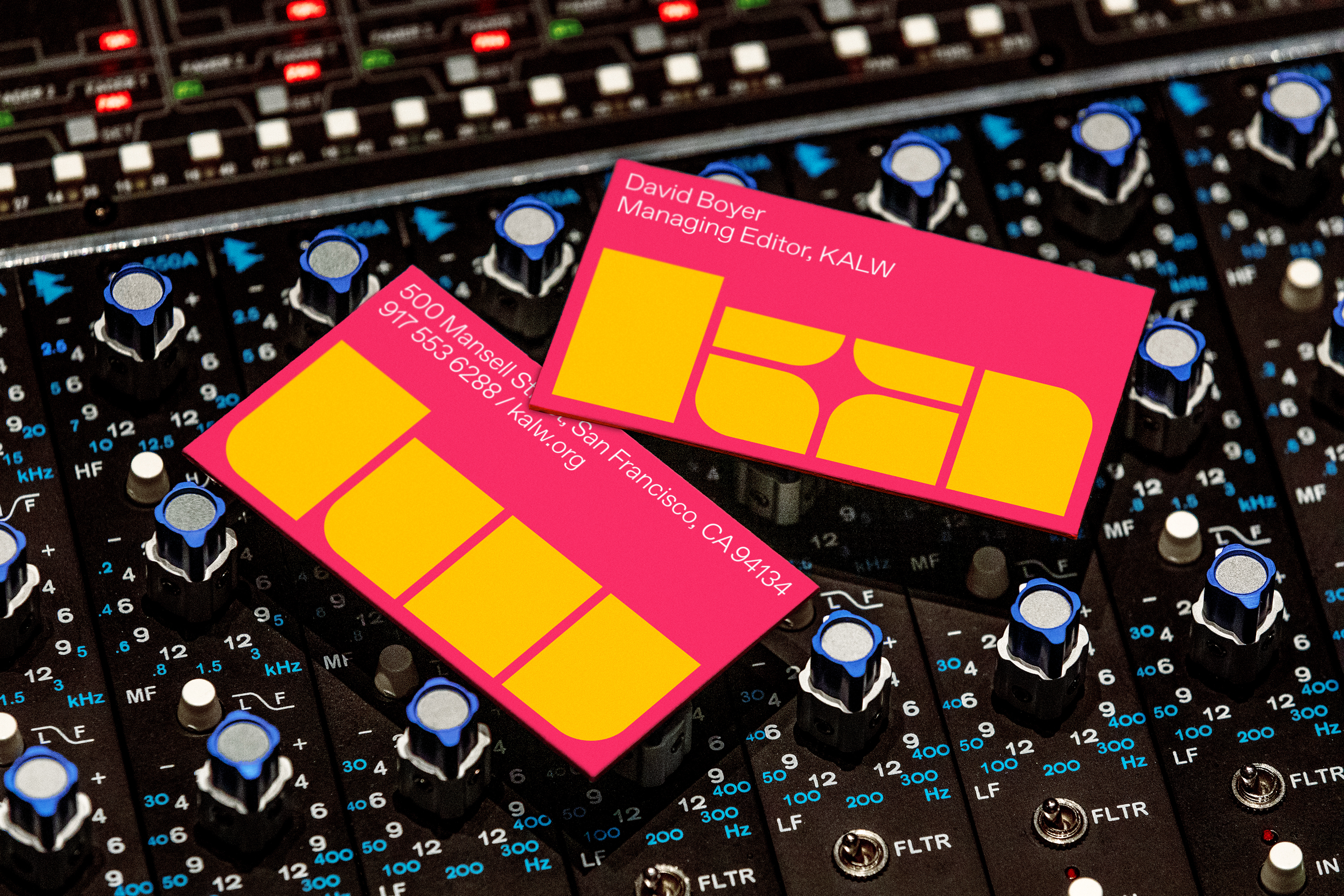
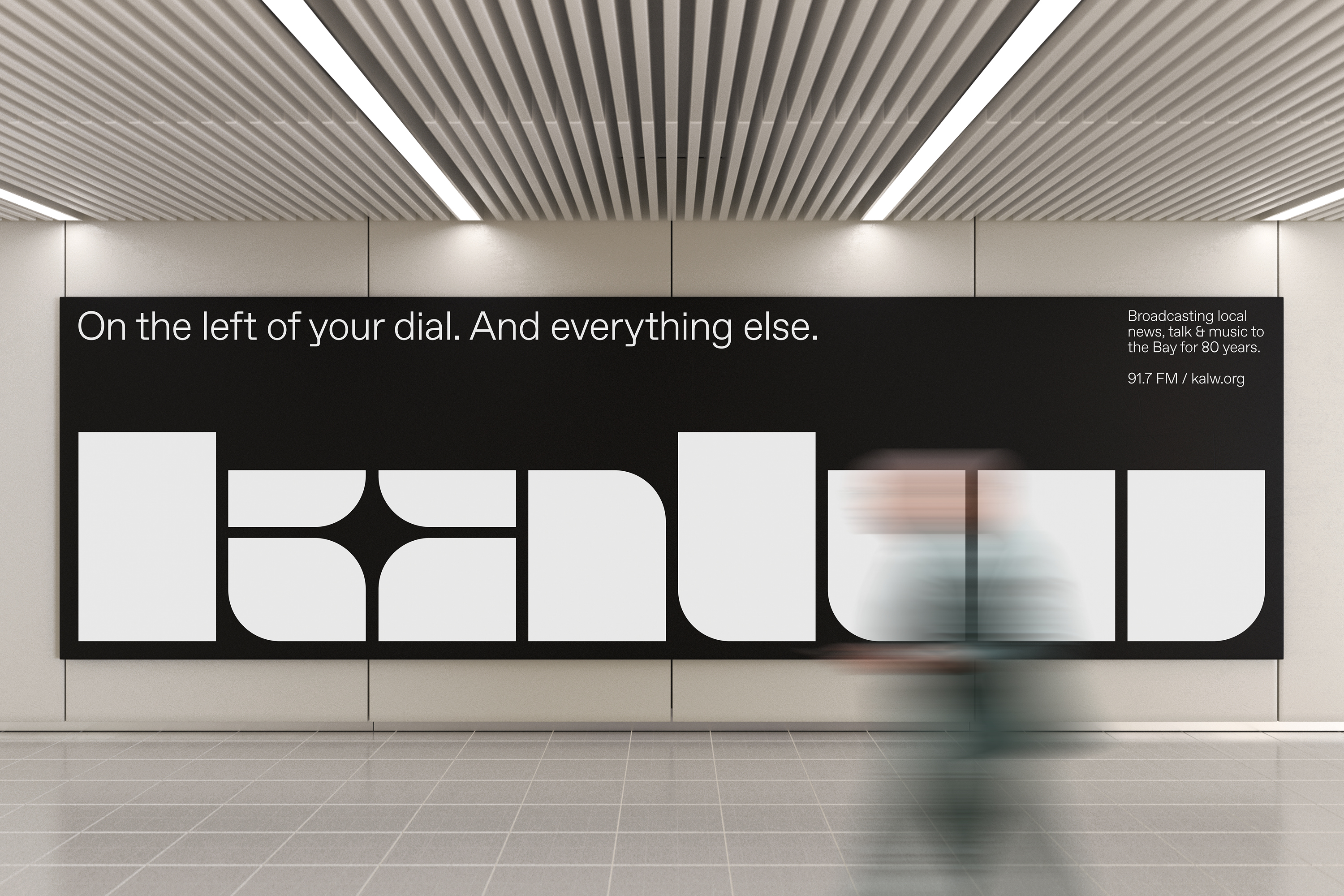
A bold voice travels far, so we wanted a symbol that is as powerful as KALW’s and expresses the vibrant future they want to build with their community. The star created between the “k” and “a” represents the epiphany of a new idea as well as the intersection of people where those ideas happen.
We also wanted a logo that could act as the main source of imagery in KALW’s communications. This would allow their brand identity to be the hero, and help them stretch their marketing budget—which is a big deal for a local public radio station.
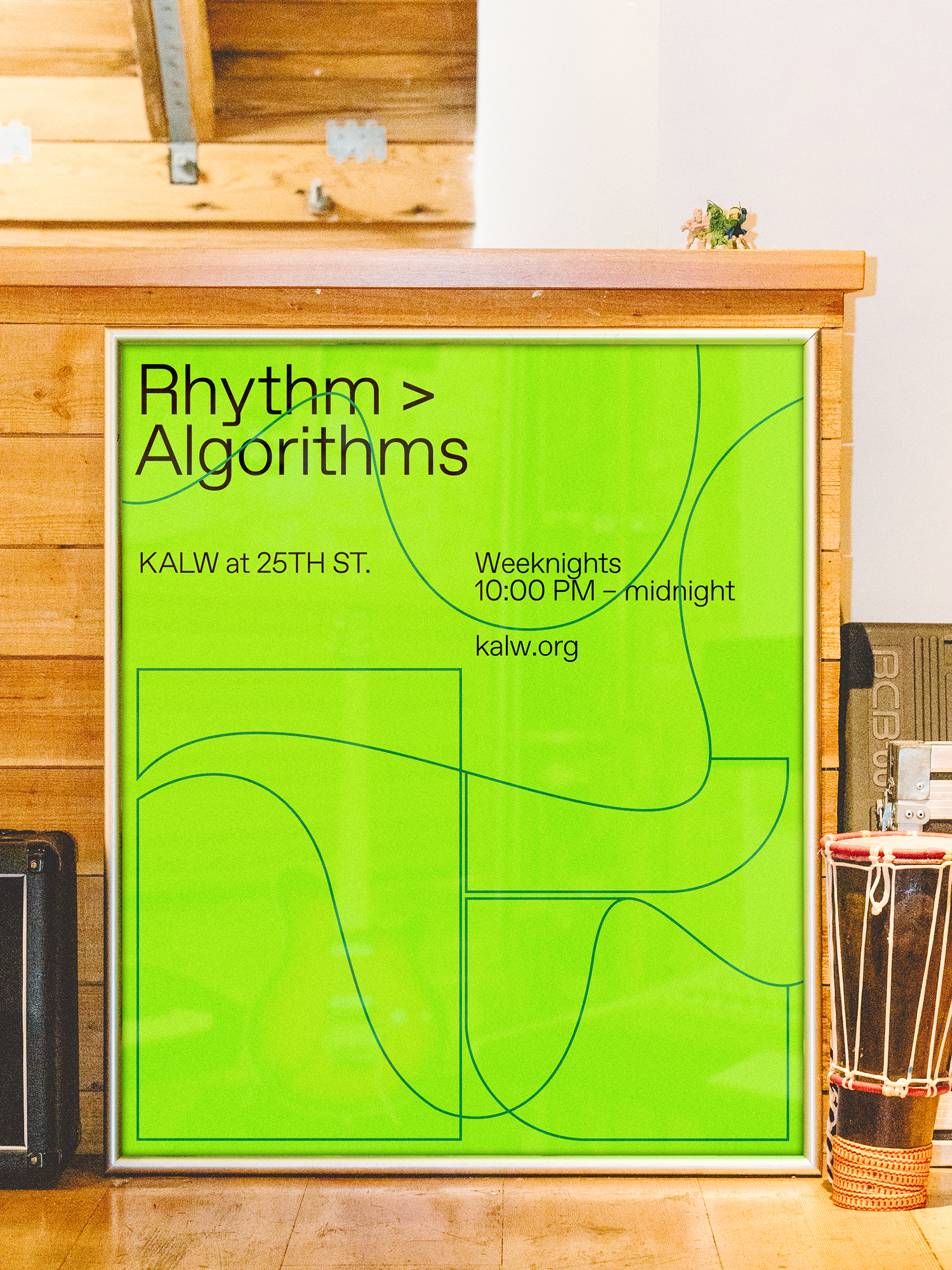
Relying on type, color and the abstract letterforms of the logo called to mind the arresting simplicity of jazz and classical concert posters from the 1950s and 1960s. Thinking of these applications and our use-cases led us to a bright color palette to draw people’s attention, a clean display typeface to counterbalance the logo, and a tone of voice that conveys a sense of KALW’s progressive attitude.
Working closely with KALW’s team, we were able to craft an identity and system that could grow with them as they continue to reimagine and redefine what being a local radio station means.